Let’s discuss the White Sox’s City Connect uniforms

After seeing the Boston Red Sox’s Boston Marathon-inspired yellow-and-blue City Connect jerseys during their series against the White Sox in Fenway Park in April, fans began speculating what Nike and the White Sox might use for inspiration when they get their turn.

The answer? Themselves.

The White Sox unveiled their new spin-off uniforms this morning in a social media blitz …

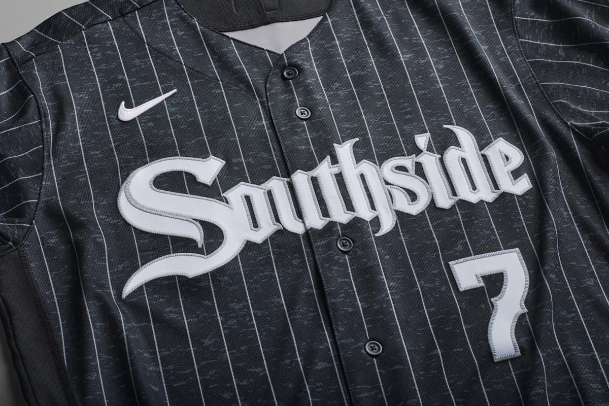
… and here’s a closer look at the elements:

How are we feeling about them? Here are my quick impressions:

PROS

White pinstripes on dark fabric: They’re a nice Sox spin on an homage to the Chicago American Giants, whose most famous uniforms were dark blue with white pinstripes. This might’ve been unintentional on Nike’s part, because the White Sox’s press release doesn’t mention this.

The White Sox City Connect Jersey features a design that celebrates a team mindset centered on grit and drive that is synonymous with the White Sox and the team’s fan culture. Proudly displaying “Southside” in the White Sox Gothic script across the jersey’s chest, the graphic nods to the organization’s storied history of the ballpark’s Chicago location that transformed over a century into a team identity.

The dark grey uniform draws inspiration from Chicago’s well-known Greystone architectural style. Providing a fresh take on the iconic White Sox pinstripes, the color scheme and pattern create texture to symbolize the team’s brand identity and pay tribute to the look that has permeated through Hip Hop and youth culture.

The patch: I mourned the loss of the Diamond Sock on the White Sox’s road grays, so it’s nice to see them survive the jump to a different uniform.

Numbers: When you go to a game at Coors Field, you soon realize that the only thing distinguishing a White Sox jersey from a Rockies jersey from the back is a hint of purple on the latter. That made it way too easy to imagine the White Sox acquiring Nolan Arenado, and that road only leads to disappointment. I wouldn’t mind seeing a more distinct name/numbering approach, and you can see the effect on a double-digit number like Dallas Keuchel’s.

CONS

Southside as one word: “South Side” is two words. “Southside” makes it seem like these were repurposed from another city, or a movie that didn’t have MLB licensing. Mashing them together makes it easier to see other things, like “Smithfield” or “Smashmouth.” If Smash Mouth adopts this look at their merch table, you’ll know this is a dead end.

The Chicago Tribune “C”: The Trib didn’t staff a beat writer for the Sox for multiple seasons!

Black and white: It feels like the throwbacks and special edition uniforms are a reason to experiment with colors you don’t normally associate with the club. The grayscale Players Weekend uniforms from two years ago were disappointing for the same reason.

All in all, I’m underwhelmed. I suppose I’d rather see a wild swing at something audacious/garish if they’re designed to be redesigned after a year three years. These look like they’re designed to sell at Chicago Sports Depot, which they will be starting today. That’s probably the point for the Sox, but it feels like it misses an opportunity. The White Sox are no strangers to revisiting themselves, and often to their detriment, so I think I welcome the signs of outward inspiration.
Take a second to support Sox Machine on Patreon
Jim Margalus
Jim Margalus

Writing about the White Sox for a 16th season, first here, then at South Side Sox, and now here again. Let’s talk curling.

Articles: 3913
55 Comments
Oldest
Newest Most Voted
Inline Feedbacks
View all comments
asinwreck

Could be an ACE uniform next season.

Shingos Cheeseburgers

They’re blah but I’ll give credit where it’s due. These could have been truly ugly and directly offensive but they’re not. Well done, Sox!

calcetinesblancos

I take comfort in the fact that the uniforms didn’t offend you.

As Cirensica

I like this uniform. I don’t like the spelling of Southside for the reasons Jim mentioned although it feels a bit weird for me saying that as I am not a “South Sider” per se as I live in Canada, and was born and raised in Venezuela. The black is not entirely black as it has some sorta gray camo in it. Hardly distinguishable from the distance.

burning-phoneix

The black is not entirely black as it has some sorta gray camo in it. Hardly distinguishable from the distance.

Just noticed that. One of the few things I dislike about the jersey. Wish it was pure #000000 black.

itaita

I agree. They should’ve gone with blacker then black. Like you cant get none more black.

Joliet Orange Sox

Maybe Anish Kapoor owns the rights to the blackest fabric dye like he owns the rights to the blackest paint and is unwilling to share.

Anish Kapoor story

hotdognoketchup

Vantablack

calcetinesblancos

I’m a big fan of the jersey, but not a fan of the hat. If they would have just done the “C” and done it in grey I think it would look much better, especially in contrast to how busy the jersey is. But the names in grey look awesome, and I’ve always thought just one outline of grey around the numbers and Sox logo would look good on all their uniforms instead of the black and then white again outline they use.

Also, I see a lot of Cubs fans whining on twitter about these unis, so you know they much be good lol.

burning-phoneix

I really like these Jerseys. Talk on social media seems to be really positive so surprised by the more muted reaction here.
Are they available for a limited time only or are they gonna be a recurring part of the jersey lineup? Just wondering to know if I should buy them before they’re sold out.

salukidog

Jim is 100% correct about “Southside” being 2 words. Also, nobody I know ever says the word “Chi” when talking about Chicago.

dat gummit

Ditto. I cringe any time someone says they’re from “shy-town” or “the shy.”

MarketMaker

i had to listen to an actor on a major TV show repeatedly say chi-town on camera just a few weeks ago. even worse, he said it like ‘chai-town’. i thought about correcting him, but something tells me others will take care of it when the episode airs.

raylewis67

I’ll be honest, I’m having a hard time being too cynical about these. I think the Medieval English lettering and numbering is pretty great. I have a differing opinion from you when it comes to ‘Southside’ as one word–I agree that South Side is two words, properly, but I don’t think it’s particularly inauthentic since I’m sure many of our own are oblivious to that fact. In a way, I like how it transforms the term from being a geographic location to more of an abstract adjective–this team is a Southside team–especially given that many fans, like myself, aren’t geographically on the South Side.

My last thought on this is the influence of Tim Anderson on the design of these uniforms is very loud. I don’t think he put pen to paper to make these uniforms, but if you look at the aura of his instagram, it wouldn’t be hard to think that he did.

Just John

I’m joining the minority on “Southside” as one word. It’s probably my favorite part of the jersey. This was very well put:

I like how it transforms the term from being a geographic location to more of an abstract adjective–this team is a Southside team–especially given that many fans, like myself, aren’t geographically on the South Side.

However, I do agree with the argument that they missed a rare opportunity to experiment with color variations for fun. This jersey actually seems like one that could stick for several series each year.

Brendan

I agree with everything you say. I’m surprised Jim is so blah about them. I love the hats more than the jersey and I love the jersey. Southside is a statement. Chi IS used in Chicago. And I thought the same thing that TA had influence here and that’s a good thing. I bought two jerseys so far and want to get a hat.

salukidog

Another money grubbing scheme from from the Sox & Nike…No Thanks.

calcetinesblancos

Both are businesses.

mikeyb

I like these uniforms quite a bit. I like that they aren’t pure, jet black. I would have gone with an “h” that doesn’t have a little tooth sticking out at the bottom, and as everyone else has mentioned, South Side is two words. But other than that, these look good on Tim and Yoan. (I do have some concern that these will look hideous on Lynn and Mercedes, but such is life for our beefy boys).

Not completely sold on the hats. If these uniforms really are going to be around for 3 years, and the goal really is to sell as many as possible, I think you could rotate some hats through here. Wouldn’t mind the “C W S” 35th and Shields hats they have out there for a series. Could also be a fantastic opportunity to try to bring Chance the Rapper back into the fold with and have him design another hat or two.

calcetinesblancos

Yeah the hats are the weak link. I think a really cool hat for these would be the classic hat style with the light front (a la 1983 Sox uni), but the light part is grey, the back is black, and then it just has that Tribune-style black “C” on the front.

LuBob DuRob

These are awesome or should it be awe some…
I wouldn’t change a thing.

Right Size Wrong Shape

I agree, these unis are fresh. After seeing the Boston unis I was scared, but these are nothing to be ashamed of. I’ll take pride in seeing my Sox don these.

awkwardsilence

I don’t like them either, but I think the pinstriping and the numbers are the worst parts. My 14 year old daughter tells me I’m wrong.

Root Cause

Does anyone even care that dark colors are hotter?

LuBob DuRob

Yes, more home runs.

Tweaky

As long as they don’t hire Costanza to try to make cooler uniforms I think they’ll be ok

Joliet Orange Sox

For some reason, I was hoping they would feature the Diamond Sock in bright Illini colors. Still good to see the Diamond Sock.

palmettoman

I agree with Jim that if the objective was to create something really different & bold this is a swing and a miss. But if the objective was to create a cool jersey and hat that will sell they hit it out of the park. I’m in my late 50’s and grew up in the near west suburbs, been in the south for 30+ years now, and plenty of people in my lifetime have used the term “Chi-town”. Guarantee (rate?) that the Cubs won’t come up with anything this cool.

metasox

“Chi-town” certainly used. And, IMO, preferable to ‘Chicagoland” which I have always hated and refuse to use

GrinnellSteve

I was hoping they’d do something inspired by the city flag. Help emphasize that this is Chicago’s team (even if that’s not quite true yet).

They look like something Chris Sale would cut up.

MrStealYoBase

I would bet that the Cubs do something with the flag/6 pointed stars. The color scheme already matches.

Shingos Cheeseburgers

I hope they do and then everyone can pile on them for stealing the Red Stars aesthetic

Jason

I don’t particularly like these uniforms, but I also get that as a Certified Old™, they’re not really for me. They look slick on TA and Moncada though.

Brendan

Nike is going for the young, hip, NBA style crowd. Look at the new NBA uniforms. That’s what kids want and the Sox are rightfully going for that.

MarketMaker

these aren’t doing it for me and it’s all about the font treatments. ‘Southside’ is so asymmetrical that it bothers me to look at. and the hanging ‘h’ is no bueno. the letters on the hat feel really unbalanced as well. The ‘C’ is like 2x the ‘h’, which is 2x the ‘i’. something about that plus the downward diagonal direction is a total miss for me.

i feel like these were created by an XFL team or some other alternative/knockoff league. it’s got that ‘modern without ever being in the moment’ look that immediately dates uniforms.

To Err is Herrmann

These are okay. After seeing what they did in Boston, I’m just glad they are not florescent orange and green. I wish the red uniforms of 1971-75 would be rotated into the uniform choices. Fun fact: An alternative newsweekly magazine called New Times, which sought to compete with Time and Newsweek circa 1973-75 devoted their final issue to the theme of American decadence. One example they gave of decadence was the White Sox’ red uniform because the hosiery of the uniform was red with only a picture of a white sock on it. Another fun fact: Bill Melton later went into mens’ wear.

tommytwonines

These jerseys are gonna sell. The numbers are a bit odd, though – it looks like the “60” is melting on Keuchel’s uni.

Chi-town and Chicagoland are okay. “Shy-town” – no.

Gotta hop a plane to Frisco now before heading east to NoLa, then up to the Big Apple and Beantown!

Last edited 1 year ago by tommytwonines
East Side Pride

They’re going to sell to non South Siders, that’s for sure. No one says I’m from Chi town, Shy town. We say we’re from da South Side, or West Side, then your specific neighborhood. It is a nice try through

metasox

I travel around, live part-time in the West and have had a few people reference the name Chi-town.

East Side Pride

You’ve heard More reference thier specific area is what that means. Same all around town. Thanks for the intel

tommytwonines

When you say “we” you mean “me” because I’m from Marquette Park. We never said “da South Side” there because we didn’t play into those dumb stereotypes. Dumb.

Last edited 1 year ago by tommytwonines
East Side Pride

No shit you don’t say it In Marquette Park, it’s an explanation for people that Don’t live in The South Side & wonder why i would have a Southside jersey on. Say all you want, it’s never 1 word. & Chi ¿ Okay chives

BuehrleMan

a design that celebrates a team mindset centered on grit

WTF?

MarketMaker

grinder rule #46: center your mindset on grit

Buehrlesque

I’m going to take what might be a minority opinion and say I wish they didn’t use South Side (or Southside) at all. It feels cliched and limiting. I’m not oblivious to the team’s location or neighborhood history, but there are plenty of Sox fans across the city, state, and as we see even here on SM, world. I never got into the “north side vs. south side” thing. I am a Chicagoan, and a Sox fan. I wish there was a different, more creative/clever angle to play up. I also know these uniforms and this marketing isn’t intended for me anyway. so no harm I guess.

metasox

I am not sure but maybe it has become kind of trite. But I can understand the point to using something that feels “limiting” from which to establish an identity. Much of the south side is the oldest part of Chicago so represents tradition, it is grittiness like rail yards, and it offers a cultural angle in hip hop which I think is good to tie in.

As Cirensica

This a well written point

East Side Pride

I grew up in the East Side neighborhood, on the far South Side. Always 2 words. No one ever says I’m from Chi Town or Shy Town. Most you meet here or that were born here, outside of Chicago will tell i was born & raised (insert area) South Side, in the (insert hood) East Side 2 be specific. They are marketed for Non North Side, Chicagoland, & out of towners who want 2 explain it’s Chi like Chiraq, not Chi like Chives

Last edited 1 year ago by East Side Pride
xubrent

I personally like it. My kids love it so It’s great by me. I thought the white stripes on black was tacky but Jim’s explanation makes sense. I feel like the term ‘Chi’ seems to be media-driven, but I’m not hooked into the southside pulse to know if someone actually uses it. But I can see myself buy that jersey. and Twitter definitely approves, so there’s that !!

Maybe this is supposed to distract us from the renaming of Loretta’s Lounge. wtf WSox ?!?

Josh Nelson

I love the uniform. I’m not crazy about the cap, but I think the current cap works with the top.

If we weren’t standing in line waiting for the doors to open at Sports Depot, I don’t think Kim gets her Tim Anderson jersey.

Brendan

I actually like the cap more than the jersey, and I love the jersey.

Sox are going for the young kids that are huge NBA fans…and that’s smart. MLB needs to see the future and start to ‘change the game’

Michael Kenny

Love the jersey, don’t like the hat. I don’t have the same hate for “Chi” that others do; it feels like something for gatekeepers to get upset about for no reason, like deep-dish pizza or “Willis Tower”. I just wonder why you’d ditch the Old English S on the hat when it’s prominently featured on the jersey.

Greystones also seem like a stretch, considering it’s a totally different shade of gray.

As for “Southside” vs. “South Side”… I guess if you had two capital S’s they’d need to be quite a bit smaller, and I like how the big one jumps out. I agree that it’s two words (we didn’t come here from SS, after all), but I’m willing to let it slide.

Last edited 1 year ago by Michael Kenny
vince

They both look cool. I don’t understand the hangup on ‘chi’, it’s a visual element that looks good – who cares if people say it or not.

Anyway I am not surprised Jim doesn’t like it given he is proven to be a 60 year OPOS, credit to the young actor who plays him on the live streams though does a really good job of lip sync.

Last edited 1 year ago by vince
hotdognoketchup

I bought one and I dig it overall. I like the feel of the lightweight style and that it is more true-to-size fit vs Majestic jerseys. Biggest issue: there is no number on front of the player replica jerseys… but i’m also not about to drop $450+ for a on-field one.